Find the story in the comparison.
Bring comparisons and trends into a focused reporting experience that invites exploration.
Sales comparisons, operational trends and category performance.
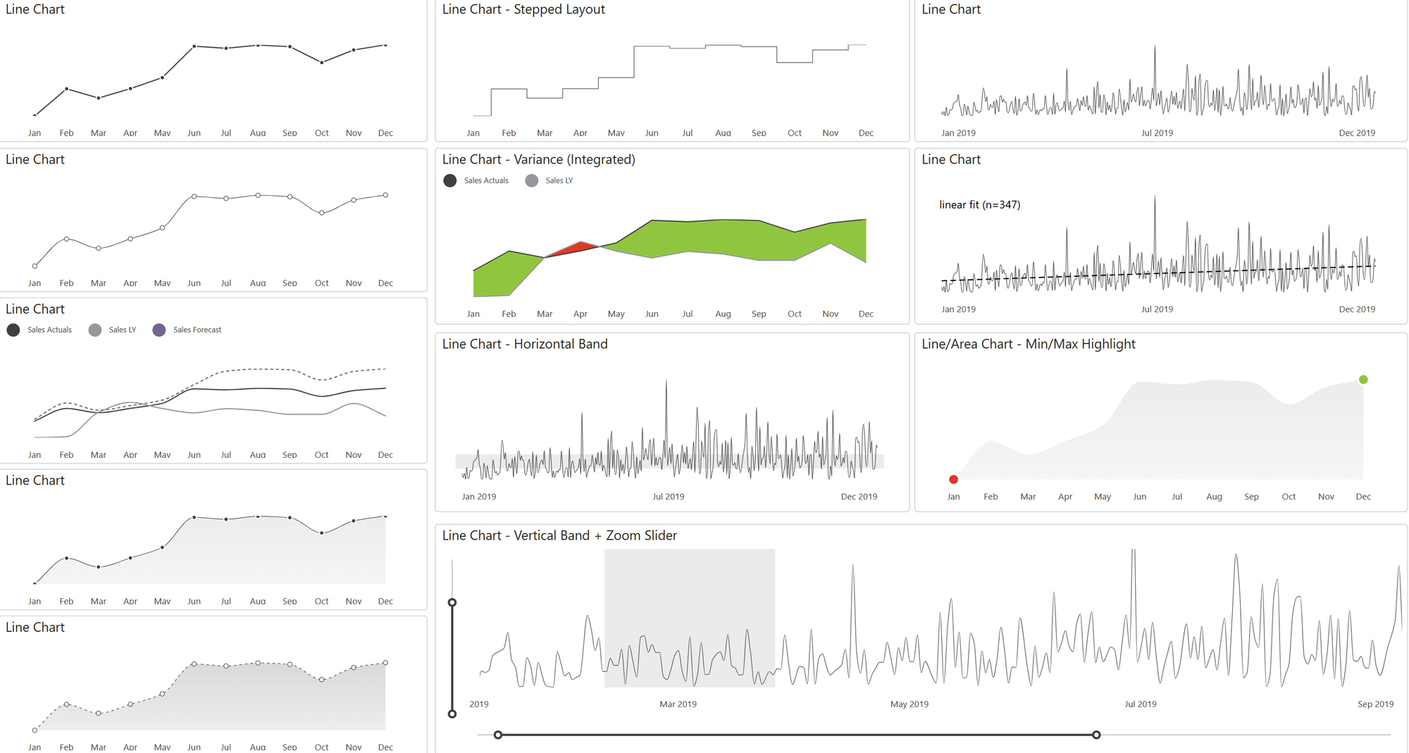
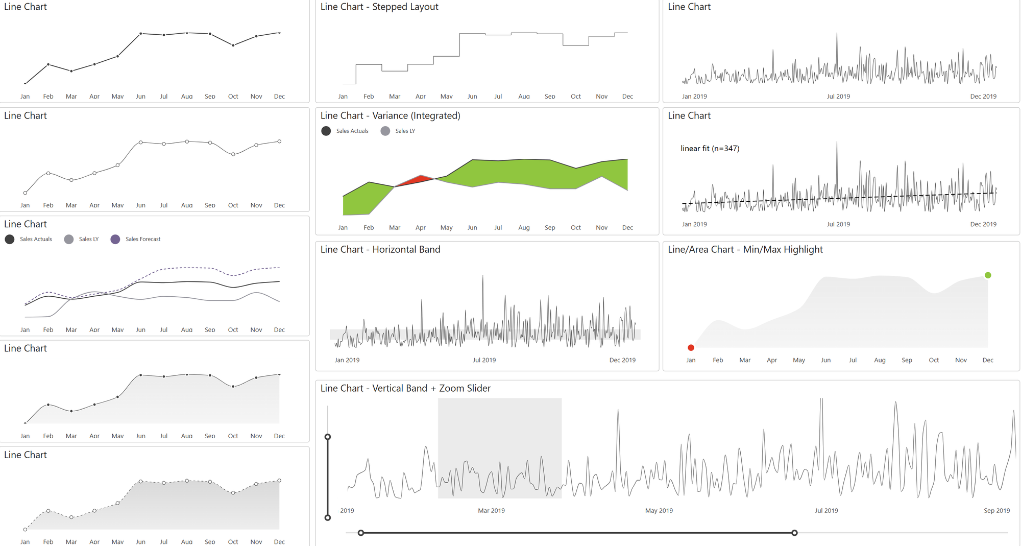
Line, area, column and bar charts
See the relevant feature demonstration below and review the Knowledge Base for setup and usage guidance.
01
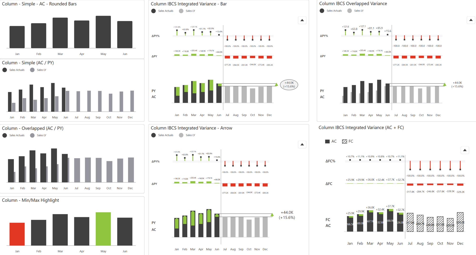
Integrated variance and actual/forecast comparisons
See the relevant feature demonstration below and review the Knowledge Base for setup and usage guidance.
02
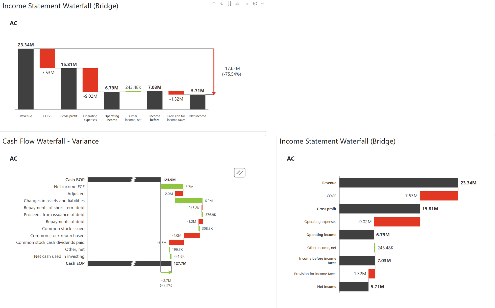
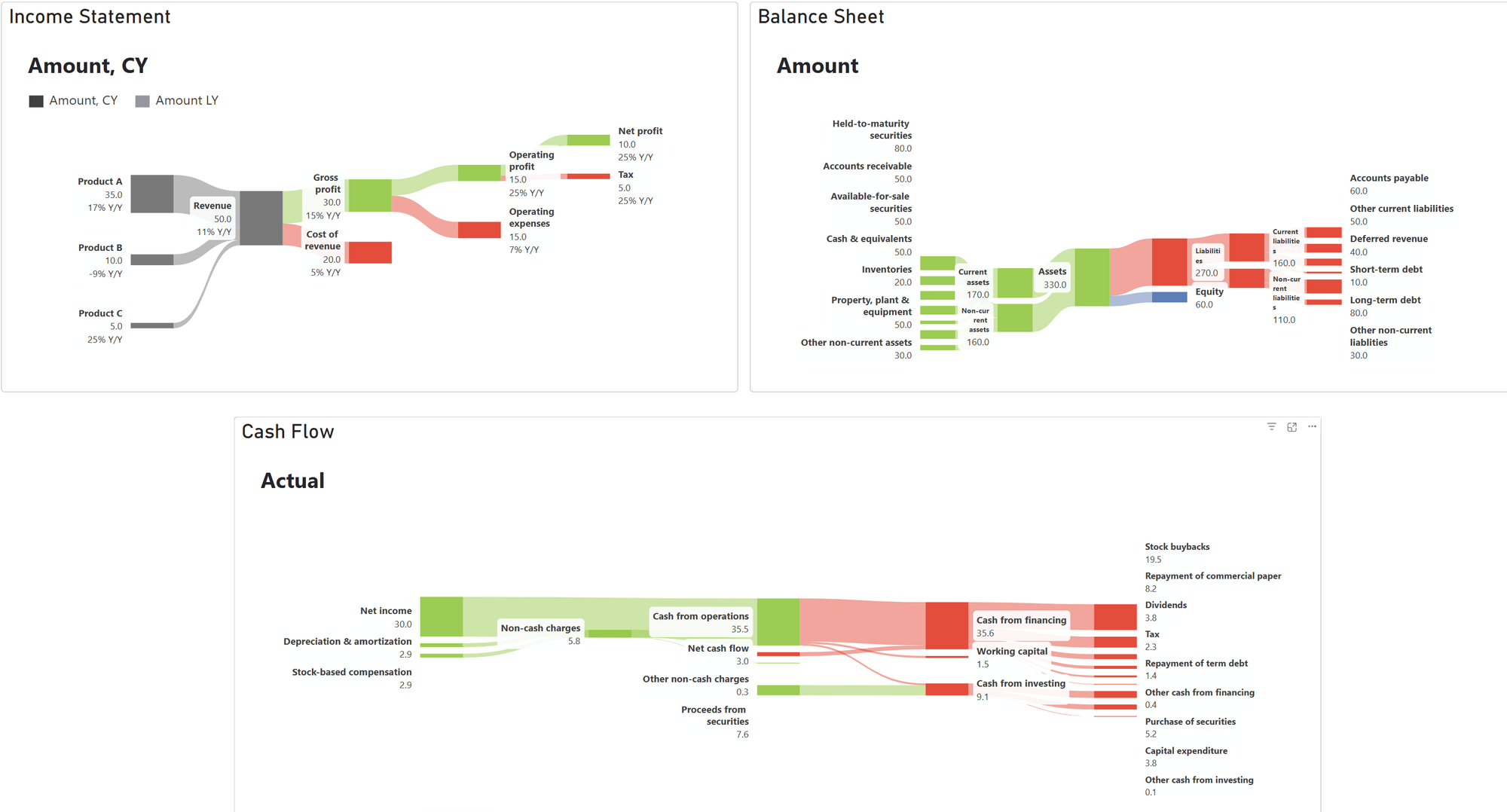
Waterfall bridges and Sankey financial flows
See the relevant feature demonstration below and review the Knowledge Base for setup and usage guidance.
01
Built for clearer reporting
Sales comparisons, operational trends and category performance.
Explore the screenshots and individual demonstrations below. Product compatibility, deployment and licensing are confirmed for your requirements.
- Line, area, column and bar charts
- Integrated variance and actual/forecast comparisons
- Waterfall bridges and Sankey financial flows
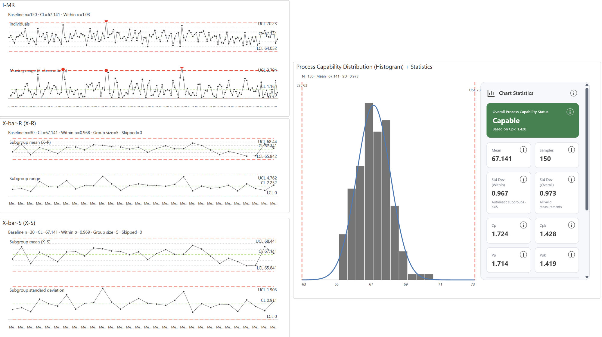
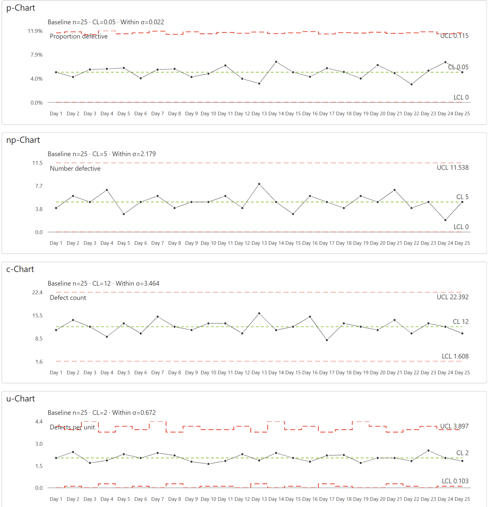
- SPC control charts and process capability statistics
PRODUCT LICENSING & SUPPORT
Let’s find the right fit.
Chart essentials
- Start with a simple chart
- Line, column and bar presentations share one visual.
Analytics & context
- Make the extremes stand out
- Highlight minimum and maximum values directly on lines and columns.
- Add horizontal and vertical bands
- Value ranges and category ranges stay independent.
- Show uncertainty with error bars
- Asymmetric bounds on columns and shaded error bands on lines.
- Add trend lines and reference values
- Linear trends, equations and a model-aware mean line.
Integrated variances
- Read the gap between AC and PY
- Green and red areas make the change part of the line chart.
Zoom & responsiveness
- Zoom in on both axes
- Horizontal and vertical sliders keep report filters unchanged.
- The IBCS chart follows the canvas
- Resize and watch comparisons reflow into the available space.
IBCS business charts
- Use the complete IBCS comparison
- Integrated columns, scenario patterns and aligned variance bands.
- Choose an IBCS main chart
- Columns, bars, lines and waterfalls retain the same comparison logic.
- Explain changes with an IBCS waterfall
- Relative and absolute differences align with the main waterfall.
Financial statements
- Tell the financial story
- Income statements and cash flow use real Result endpoints.
Statistical charts
- Detect signals in the process
- I–MR control charts show limits, moving ranges and rule signals.
- Group raw observations automatically
- X̄–R creates subgroups and a companion range chart.
- Put capability next to the distribution
- Histogram, normal curve, specification limits and Cpk statistics.
More chart families
- Explore distributions and flows
- Box plots and Sankey diagrams reveal different sides of the data.
Product screenshots