See your operation as a whole.
Bring the metrics that matter to manufacturing teams into one considered performance view.
Manufacturing performance reviews and production reporting.
OEE, OOE and TEEP performance views
See the relevant feature demonstration below and review the Knowledge Base for setup and usage guidance.
01
Availability, performance and quality analysis
See the relevant feature demonstration below and review the Knowledge Base for setup and usage guidance.
02
Reliability, downtime, Takt, SMED and FPY sections
See the relevant feature demonstration below and review the Knowledge Base for setup and usage guidance.
01
Built for clearer reporting
Manufacturing performance reviews and production reporting.
Explore the screenshots and individual demonstrations below. Product compatibility, deployment and licensing are confirmed for your requirements.
- OEE, OOE and TEEP performance views
- Availability, performance and quality analysis
- Reliability, downtime, Takt, SMED and FPY sections
- Cpk, energy, hourly rate and production loss context
PRODUCT LICENSING & SUPPORT
Let’s find the right fit.
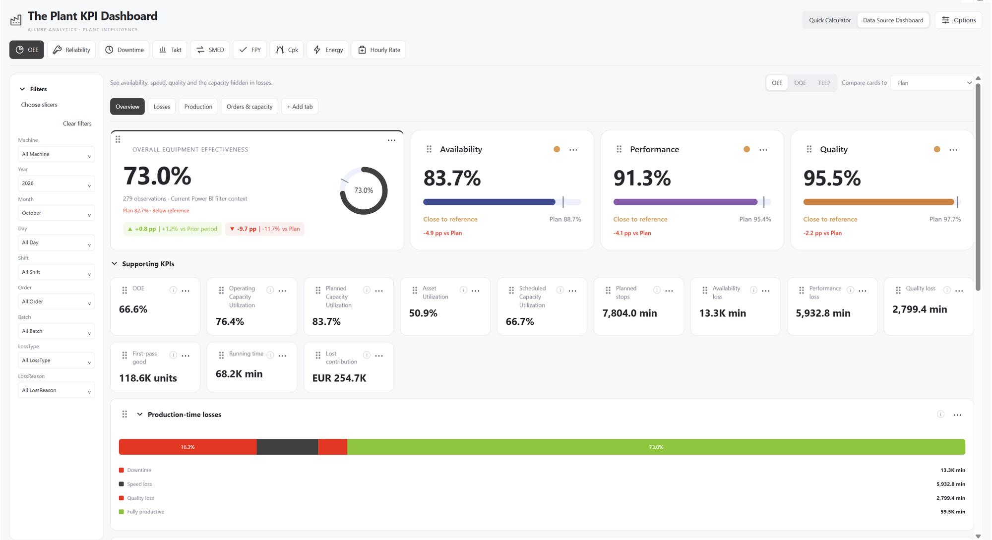
OEE overview
- Start with the OEE overview
- OEE, Availability, Performance and Quality share raw production inputs.
Integrated slicers
- Filter from inside the dashboard
- Select a plant or machine and every calculated visual follows.
Loss reasons & drill-down
- Click a production-time loss
- Availability, speed and quality losses reveal their own reasons.
- Change the waterfall breakdown
- Factor losses and explicit loss reasons show the same total from different angles.
Production & capacity
- Move from summary to detail
- Losses, Production, and Orders & capacity give each question its own view.
OEE / OOE / TEEP
- Switch OEE → OOE → TEEP
- The numerator stays consistent; the time basis changes.
Nine calculator types
- Reliability
- Use MTBF and MTTR to understand failures and recovery.
- Downtime cost
- Turn lost production time into an economic impact.
- Takt time
- Connect available production time to customer demand.
- Setup / SMED
- Compare internal and external setup work.
- First Pass Yield
- Track yield through process steps.
- Process capability
- Relate process variation to specification limits.
- Energy cost
- Connect energy use, production and cost.
- Machine hourly rate
- Turn annual machine costs into a rate per hour.
One plant workspace
- Return to the connected OEE workspace
- Nine calculators. Integrated filters. Details one click away.
Build My dashboard
- Create your own My dashboard
- Add a tab. Name it. Choose four columns for a clear KPI overview.
- Add OEE, A, P and Q cards
- Pick a calculated KPI, set its color and size, and save it to your dashboard.
- Create a custom OEE trend
- Choose Line, group by Day, and span two columns. Actual and comparison travel together.
- Mix chart types and calculated KPIs
- Availability as Area, Performance as Columns, and Quality + Performance as a combined trend.
Customize & compare
- Your own dashboard, connected to the data
- The shared comparison and country slicer update every custom card and chart.
- Explore the trends behind your KPIs
- Scroll from the headline cards to the four trends. Each visual keeps its own KPI, style and options.
- Repeat a custom trend by machine
- Use Small multiples to compare machines without rebuilding the chart.
- My dashboard, ready to explore
- Custom cards. Four trend styles. Shared filters and comparisons. All inside one visual.
Product screenshots