Knowledge Base · The Plant KPI Dashboard
Choose between a quick calculator and a data-backed dashboard.
Two ways to work
The supplied v1.0.27 preview offers Quick Calculator for entering values directly and Data Source Dashboard for data-driven reporting. Start with the calculator to understand an individual metric, then bind a dataset to explore production performance in context.
Nine calculator families
The toolbar covers OEE, Reliability, Downtime, Takt, SMED, FPY, Cpk, Energy and Hourly Rate. Each family answers a different operational question; document the input definitions before comparing results.
Start with the reporting context
The demonstration dataset covers 2026 and includes two plants, two machines, A/B/C shifts, and Actual and Plan scenarios. It is demonstration data. Use your own approved production definitions, dates and units when implementing a report.
Explore The Plant KPI Dashboard
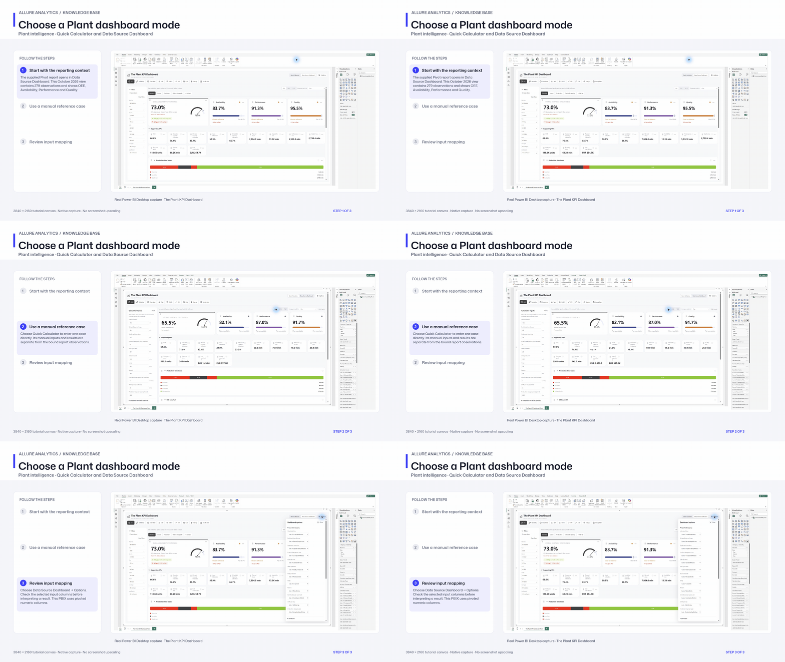
Choose a Plant dashboard mode
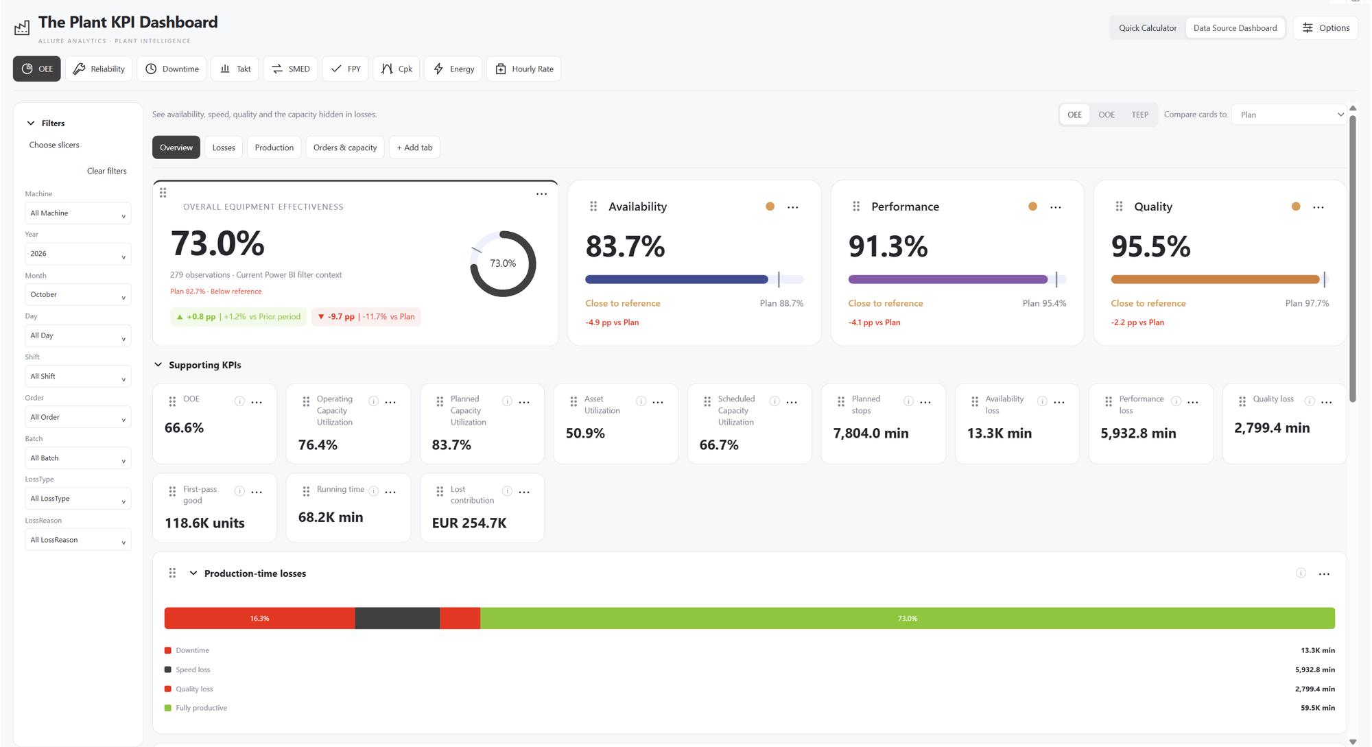
Native supplied Pivot PBIX overview. Its pivoted field contract and dataset differ from the earlier long-format HTML preview.
3840 × 2160 tutorial canvas at 20 fps. Real 2560 × 1392 Power BI Desktop screenshots retain their native size; this is a paced step sequence. Recorded from the supplied Pivot PBIX. Its pivoted numeric inputs and explicit prior-period references differ from the earlier long-format preview fixture.
- Start with the reporting context — The supplied Pivot report opens in Data Source Dashboard. This October 2026 view contains 279 observations and shows OEE, Availability, Performance and Quality.
- Use a manual reference case — Choose Quick Calculator to enter one case directly. Its manual inputs and results are separate from the bound report observations.
- Review input mapping — Choose Data Source Dashboard → Options. Check the selected input columns before interpreting a result. This PBIX uses pivoted numeric columns.