Show supplied uncertainty bounds without confusing them with target comparisons.
Use endpoint fields
| Field well | Content |
|---|---|
| Error lower | Lower bound measure at each category |
| Error upper | Upper bound measure at each category |
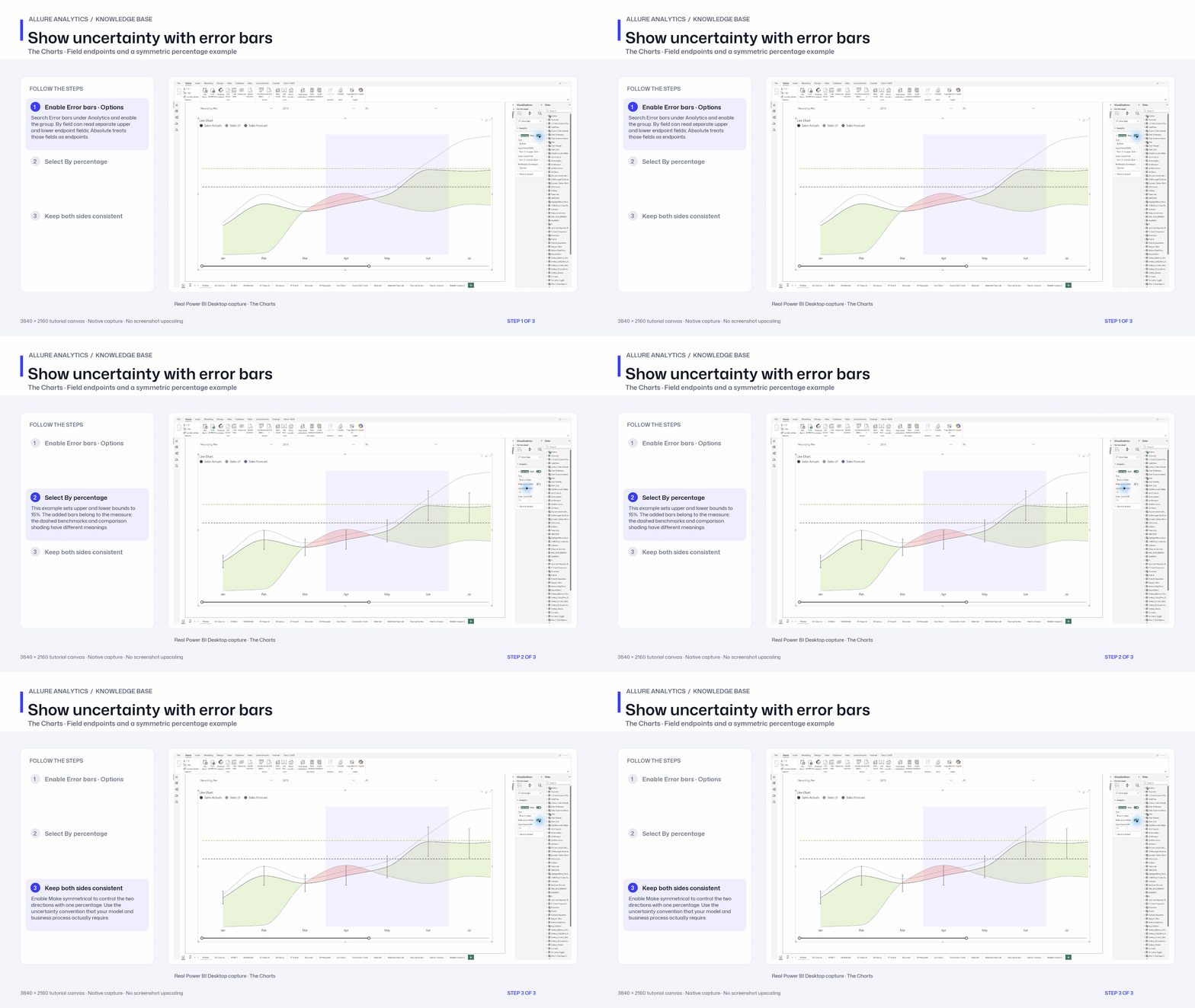
Under Analytics → Error bars, select the applicable series, relationship to the measure and field/percentage/amount mode. Choose symmetric or independent bounds where available. Fields described as endpoints should contain endpoints, not an unlabelled error magnitude.
Format bars, markers, bands and labels
- Bar color, width, transparency, border and cap size.
- Endpoint marker shape and size.
- Error band color/transparency and boundary stroke/style.
- Error label typography, units, decimals and endpoint gap.
- Tooltip inclusion and series-color matching.
Stay with the source values
Bounds remain attached to their categories and series through resize, compatible zoom and Axis Break. Missing bounds remain gaps. Error bars describe uncertainty or limits supplied by your model; a reference line is a benchmark and a variance is a comparison between measures.
Show uncertainty with error bars
Native error-bar options walkthrough. The 15% bounds are illustrative settings, not calculated confidence intervals.
3840 × 2160 tutorial canvas at 20 fps. Real 2560 × 1392 Power BI Desktop screenshots retain their native size; this is a paced step sequence.
- Enable Error bars · Options — Search Error bars under Analytics and enable the group. By field can read separate upper and lower endpoint fields; Absolute treats those fields as endpoints.
- Select By percentage — This example sets upper and lower bounds to 15%. The added bars belong to the measure; the dashed benchmarks and comparison shading have different meanings.
- Keep both sides consistent — Enable Make symmetrical to control the two directions with one percentage. Use the uncertainty convention that your model and business process actually require.