Use a horizontal filter strip or a vertical panel, with clear boundaries and readable selections.
Rows, columns and compact sizing
Responsive layout wraps controls into rows/columns and supports preferred row/column counts. Mixed control types adapt; dropdowns are the compact default. Lists scroll internally when content exceeds the available space. Slicer text defaults to 9 px and container corner rounding to 3 px.
Responsive filters arranged across available horizontal space.
Click to enlarge.
Outer versus inner padding
Container → Outer padding controls the gap between the drawn border and visual boundary: individual sides or uniform 0–100 px. Inner padding is the content inset. Quick periods has independent heading/button/informative-text fonts, size, padding, gaps, checkbox size and colors. Opening Quick periods moves following fields down; closing it reclaims that space.
Collapse follows the drawn container
Collapse/expand changes the box’s own border and background. Power BI retains its allocated canvas rectangle and selection frame; the custom visual cannot shrink that host rectangle. Use the Container border/background and disable the native border/background when only the moving outline should be visible.
Small text, usable hit area
Checkbox appearance and option-row height can be compact while the whole row stays clickable. Use larger settings where accessibility or touch interaction needs more space.
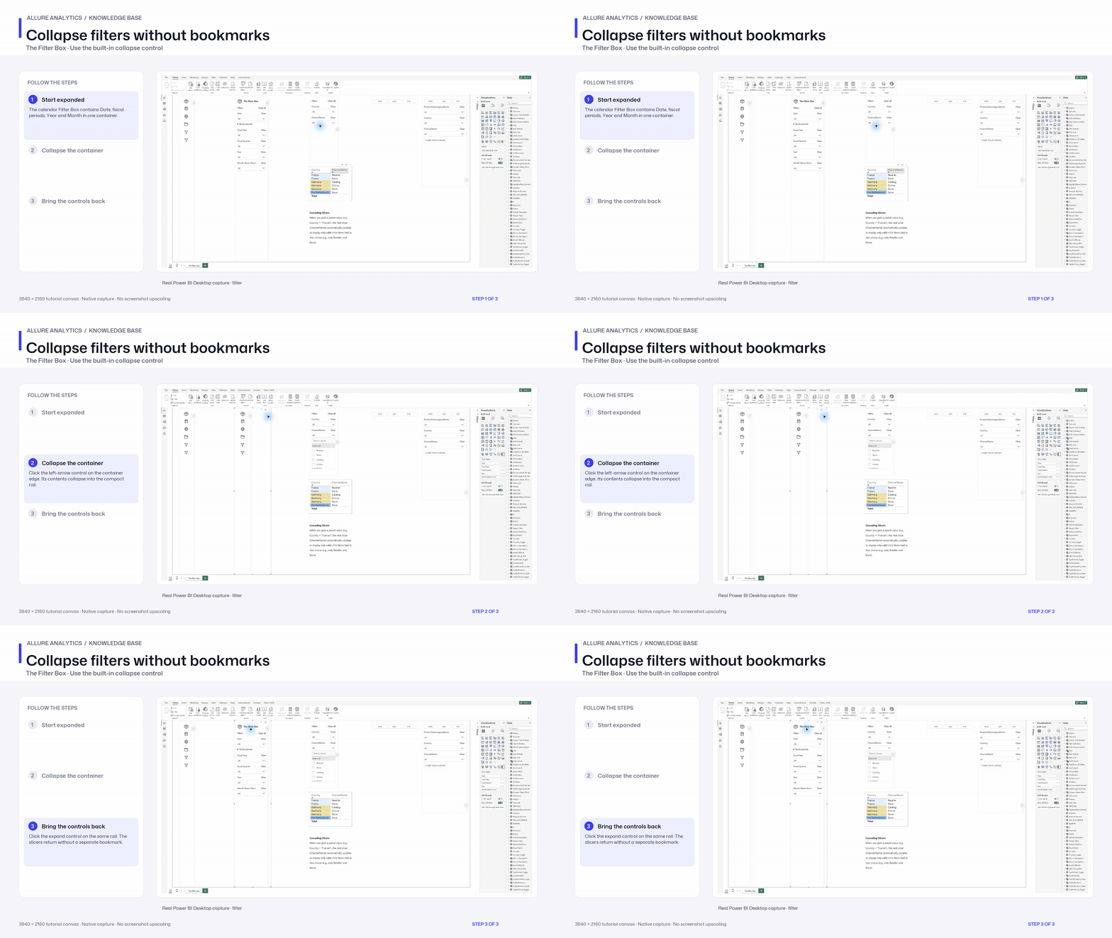
Collapse filters without bookmarks
Native collapse and expand chapter; spacing configuration remains to capture.
3840 × 2160 tutorial canvas at 20 fps. Real 2560 × 1392 Power BI Desktop screenshots retain their native size; this is a paced step sequence.
- Start expanded — The calendar Filter Box contains Date, fiscal periods, Year and Month in one container.
- Collapse the container — Click the left-arrow control on the container edge. Its contents collapse into the compact rail.
- Bring the controls back — Click the expand control on the same rail. The slicers return without a separate bookmark.