Reproduce clustered, overlapped and IBCS integrated bars/chevrons from the original column gallery.
Use the same monthly measures
Real renderers, explicit sample fields
These figures were captured from the unchanged current .pbiviz packages with documented sample data. They preserve the referenced chart families and variants. Your screenshots are included in Reference gallery. Full source data was not attached; example values are illustrative unless transcribed from a visible table. Field names and binding roles are explicit, and each example includes downloadable sample data.
| Field well | Field |
|---|---|
| Category / Hierarchy | Date[Month Name Short] |
| Actual | [Sales Actuals] |
| Previous year | [Sales LY] |
Ordinary Column layouts
Single column
Fields and settings
| Field well | Real field / measure |
|---|---|
| Category / Hierarchy | Date[Month Name Short] |
| Actual | [Sales Actuals] |
- Chart → Column → simple
- Scenario patterns; labels and optional totals
Clustered Actual and PY
Fields and settings
| Field well | Real field / measure |
|---|---|
| Category / Hierarchy | Date[Month Name Short] |
| Actual | [Sales Actuals] |
| Previous year | [Sales LY] |
- Chart → Column → clustered
- Scenario patterns; labels and optional totals
Overlapped Actual and reference
Fields and settings
| Field well | Real field / measure |
|---|---|
| Category / Hierarchy | Date[Month Name Short] |
| Actual | [Sales Actuals] |
| Previous year | [Sales LY] |
- Chart → Column → overlapped
- Scenario patterns; labels and optional totals
Stacked scenarios
Fields and settings
| Field well | Real field / measure |
|---|---|
| Category / Hierarchy | Date[Month Name Short] |
| Actual | [Sales Actuals] |
| Previous year | [Sales LY] |
- Chart → Column → stacked
- Scenario patterns; labels and optional totals
100% stacked
Fields and settings
| Field well | Real field / measure |
|---|---|
| Category / Hierarchy | Date[Month Name Short] |
| Actual | [Sales Actuals] |
| Previous year | [Sales LY] |
- Chart → Column → normalized
- Scenario patterns; labels and optional totals
Clustered separates scenarios; Overlapped shares category space. Use Breakdown / Stacking / Series when each stack represents additive category contributions. Do not stack Actual and PY as if they formed one business total unless that is the intended meaning.
IBCS integrated segments or arrows
IBCS integrated bar
Fields and settings
| Field well | Real field / measure |
|---|---|
| Category / Hierarchy | Date[Month Name Short] |
| Actual | [Sales Actuals] |
| Previous year | [Sales LY] |
| Forecast | [Sales Forecast] |
- IBCS Variance → Column → Integrated variance Column
- Variance display type bar
IBCS integrated arrow
Fields and settings
| Field well | Real field / measure |
|---|---|
| Category / Hierarchy | Date[Month Name Short] |
| Actual | [Sales Actuals] |
| Previous year | [Sales LY] |
| Forecast | [Sales Forecast] |
- IBCS Variance → Column → Integrated variance Column
- Variance display type arrow
Older screenshot captions say “IBCS Column”. In The Charts 1.9.1 choose IBCS Variance → Main chart type Column → Main chart variant Integrated variance Column. Bar produces rectangular variance segments; Arrow produces the filled-chevron geometry. The direction follows Actual versus Reference; the color follows favorable/unfavorable interpretation.
Labels and optional Total
Ordinary compatible column/bar charts expose Total labels and an optional additional Total bar with placement and separator styling. IBCS uses its own Show comparison totals control, Off by default. Source Result categories are distinct from generated totals.
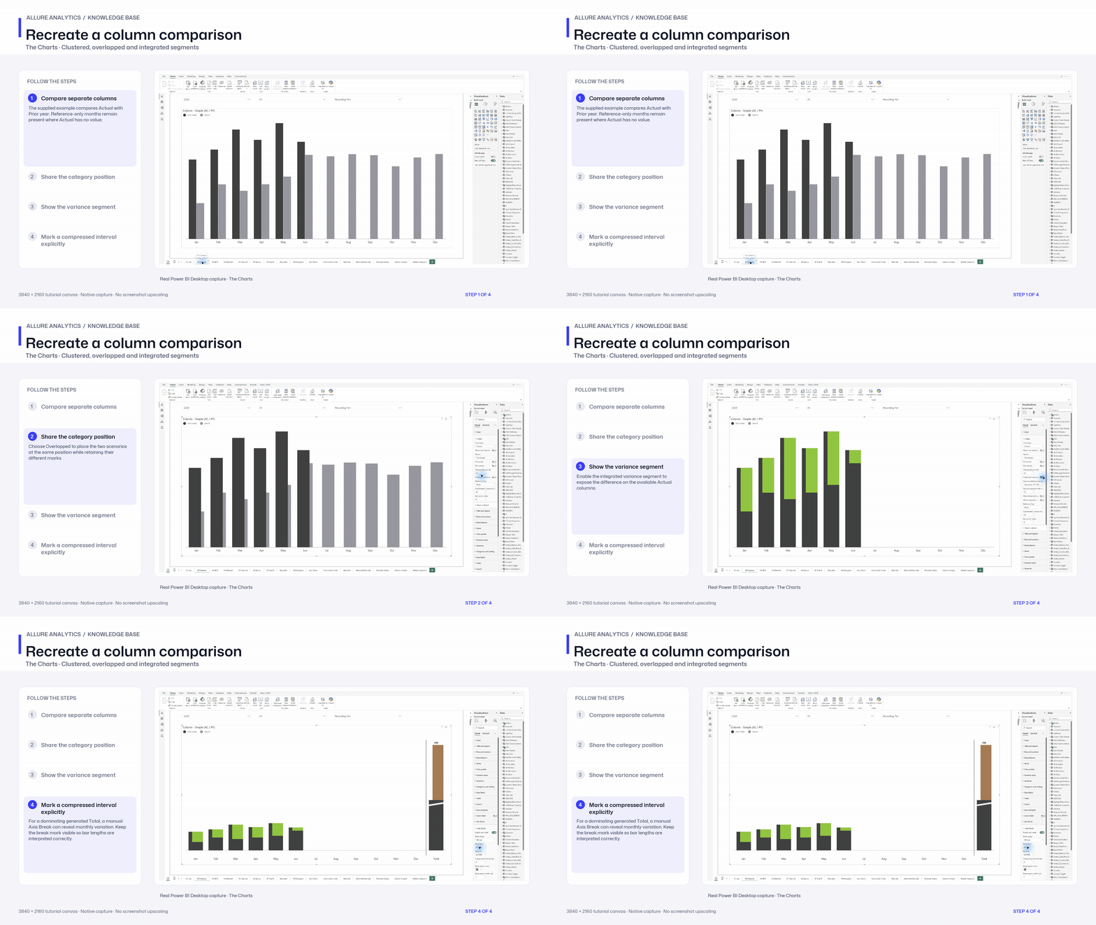
Recreate a column comparison
Native representative column recipe using the supplied monthly report; it does not enumerate every stacked variant.
3840 × 2160 tutorial canvas at 20 fps. Real 2560 × 1392 Power BI Desktop screenshots retain their native size; this is a paced step sequence.
- Compare separate columns — The supplied example compares Actual with Prior year. Reference-only months remain present where Actual has no value.
- Share the category position — Choose Overlapped to place the two scenarios at the same position while retaining their different marks.
- Show the variance segment — Enable the integrated variance segment to expose the difference on the available Actual columns.
- Mark a compressed interval explicitly — For a dominating generated Total, a manual Axis Break can reveal monthly variation. Keep the break mark visible so bar lengths are interpreted correctly.