Compare magnitudes, split contributions or place Actual against an outlined reference.
Use the right arrangement
| Arrangement | Use |
|---|---|
| Clustered | Separate bars for several values in each category |
| Stacked | Additive components within a category |
| 100% stacked | Component proportions, rather than raw magnitudes |
| Overlapped | Compare Actual and a reference in the same category space |
Scenario patterns and overlap
In Overlapped, configure Flip overlap and Overlap distance (%). Use an integrated variance segment and the Reference flag where applicable. Scenario styles offer Solid, Outline, Filled outline, diagonal/reverse hatch, crosshatch, horizontal/vertical lines and dots. Filled outline has fill color/transparency plus outline color/pattern/width; per-series overrides refine it.
Filled-outline reference styling for an overlapped comparison.
Click to enlarge.
Labels and generated Totals
Enable Totals → Show total labels on compatible clustered/stacked column/bar charts. Format their font, units, background and positive/negative split. Show additional Total bar adds a displayed additive total, with Left/Right placement, width, optional custom color and a separator whose color, width and Solid/Dotted/Dashed style are configurable.
Use totals for additive values
The generated bar aggregates displayed individual bars; it is not a replacement for a non-additive model total. Keep a ratio or distinct-count total in a model measure.
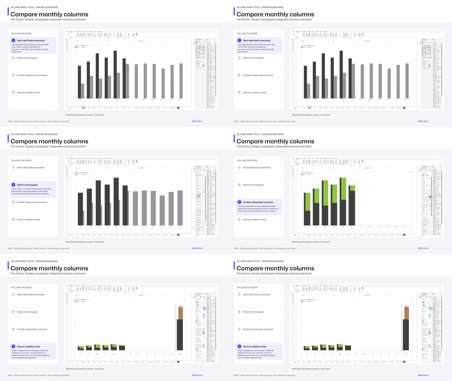
Compare monthly columns
Native column-layout chapter. Stacked, 100% stacked and other recipes remain documented in the article.
3840 × 2160 tutorial canvas at 20 fps. Real 2560 × 1392 Power BI Desktop screenshots retain their native size; this is a paced step sequence.
- Start with both scenarios — The supplied Recording Pen example uses Year 2020. Actual is available for January–June; Prior year extends through December.
- Select Overlapped — Open Chart → Column / bar layout and select Overlapped. The overlapping marks keep Actual and reference in the same category.
- Enable integrated variance — Enable Integrated variance segment. Green segments expose positive Actual-to-reference differences for the available Actual months.
- Add an additive total — Under Categories and ranking, enable the additional Total bar. Use this option for additive measures; a sum of percentages is not a valid percentage total.