Add independently switchable benchmarks and highlight either a value range or a category interval.
Independent reference groups
In Analytics, enable Constant, Mean, Median, Minimum, Maximum or Target separately. Several can be visible at once. Each has its own line visibility, value, color, series-color matching, width, dash, transparency, placement and data-label formatting. An Additional / saved reference slot retains earlier single-reference settings.
Multiple analytical reference lines with independently formatted labels.
Click to enlarge.
Points or colored bars
Reference points can use matching category points, one line end or both ends. Format radius, fill, outline and transparency. Min/Max can color matching Column/Bar marks and Combo bar series, with ties included and source blanks/generated Totals excluded. Circles stay fixed in pixels on resize and zoom.
Two kinds of bands
| Band | Endpoints | Meaning |
|---|---|---|
| Value reference band | Numeric lower/upper values | An acceptable range along the value axis |
| Vertical reference band · Category / Hierarchy | Bound full hierarchy paths | An inclusive span of categories/descendants |
The category band rotates with horizontal charts. Unavailable endpoints hide the band while retaining its saved setting. Histogram references follow its value population; incompatible families retain their own controls.
Add benchmarks and a category band
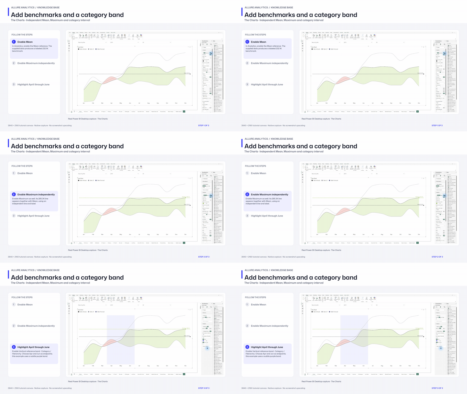
Native Mean, Maximum and vertical category-band chapter. Other reference groups and per-reference styling are retained in the article.
3840 × 2160 tutorial canvas at 20 fps. Real 2560 × 1392 Power BI Desktop screenshots retain their native size; this is a paced step sequence.
- Enable Mean — In Analytics, enable the Mean reference. The supplied data produces a labeled 232.1K benchmark.
- Enable Maximum independently — Enable Maximum as well. Its 285.3K line appears together with Mean, using an independent line and label.
- Highlight April through June — Enable Vertical reference band · Category / Hierarchy. Choose Apr and Jun as endpoints; this example uses a subtle purple band.