Use shared field wells to switch chart families while keeping the model bindings.
Core fields
| Field well | Example | Purpose |
|---|---|---|
| Category / Hierarchy | Calendar[Month]; Region → Product | Category axis or drill hierarchy |
| Actual | [Sales Actuals] | Main values; multiple measures supported |
| Previous year / Plan / Budget / Forecast / Target | [Sales PY], [Sales PL], [Sales FC] | Scenario comparisons |
| Breakdown / Stacking / Series | Product[Category] | Split marks or form stacks |
| Small multiples — rows / columns | Country; Channel | Panel partitions |
| Context / dynamic text | [Selected year] | Slicer-driven titles/aliases |
| Tooltip fields | [Units], [Margin %] | Additional tooltip detail |
Pick and configure a family
- Bind Category and Actual, plus comparison/group fields as needed.
- Choose a chart icon and open its compact options, or use Format visual → Chart → Chart type.
- Choose a compatible variant, set values, units and labels, then Apply.
- Style scenario patterns and variances independently of the chart family.
- Check a selected category and its tooltip in your report.
Two menus, the same saved chart
The icon menu and native Chart type setting use the same persisted selection. The compact menu has collapsible groups and pinned actions; irrelevant controls are hidden. Context measures provide dynamic titles rather than evaluating DAX inside the visual.
A column comparison using Actual, Previous year and Forecast with shared field bindings.
Click to enlarge.
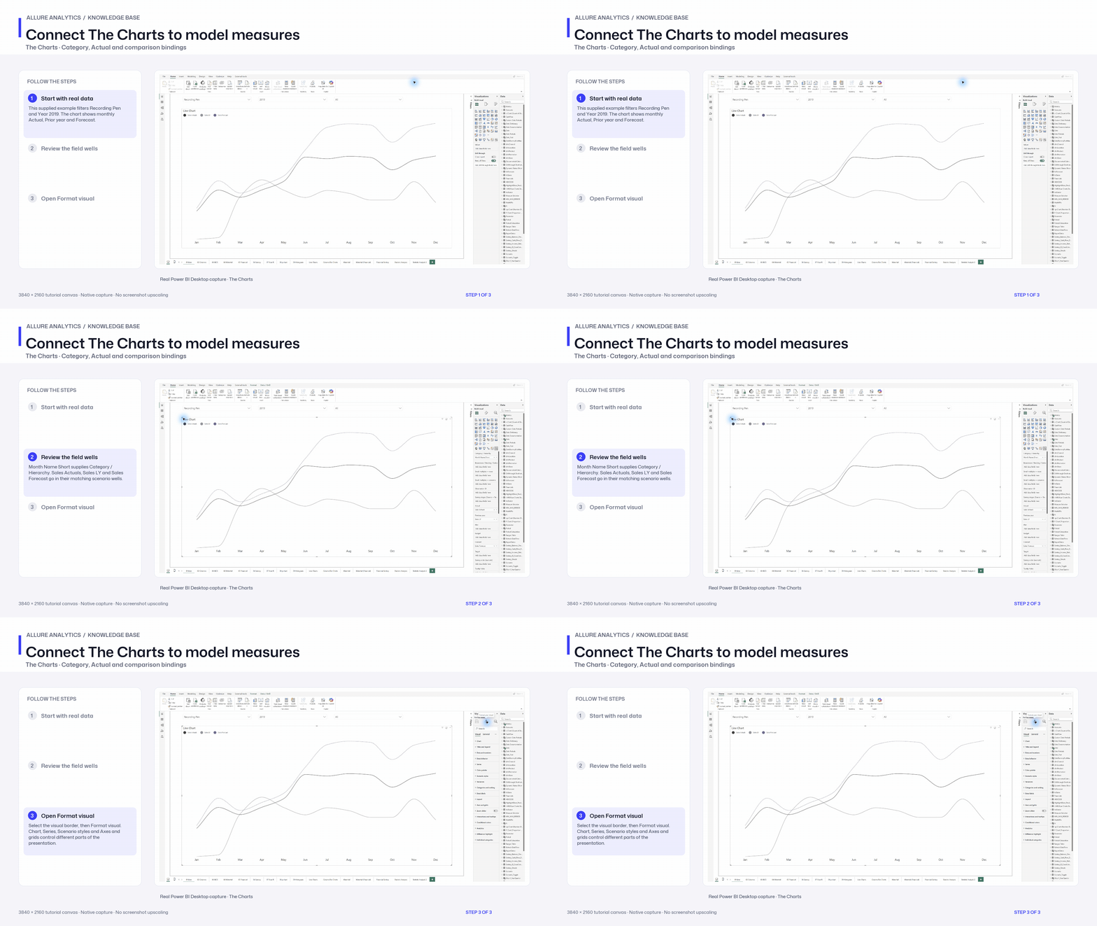
Connect The Charts to model measures
Native field-binding and Format-pane chapter from the supplied Charts report and its original model. Visual import is covered separately.
3840 × 2160 tutorial canvas at 20 fps. Real 2560 × 1392 Power BI Desktop screenshots retain their native size; this is a paced step sequence.
- Start with real data — This supplied example filters Recording Pen and Year 2019. The chart shows monthly Actual, Prior year and Forecast.
- Review the field wells — Month Name Short supplies Category / Hierarchy. Sales Actuals, Sales LY and Sales Forecast go in their matching scenario wells.
- Open Format visual — Select the visual border, then Format visual. Chart, Series, Scenario styles and Axes and grids control different parts of the presentation.